Color usage is a daily task for designers. It is essential to effective design, whether you’re creating an app or trying to decide which colors best convey your company’s identity. Color impacts moods and has cultural meaning, making it important to humans in general.
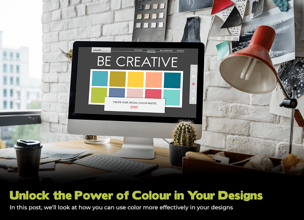
The use of color in design may either make or ruin a project. When creating any type of design, including a logo, website, or print campaign, it is crucial to grasp the power of color. While the incorrect mix of colors might make your design appear bland and unattractive, the proper combination can elicit emotion and attract attention. In this post, we’ll look at how you can use color more effectively in your designs.
Utilizing color effectively in designs
Color has a tremendous design impact. Color may influence mood, evoke feelings, and generate a visual impression. It can improve the overall impact and message of a design. Here are a few techniques to use color effectively in designs:
Emotional impact:
Different colors have different emotional associations. The use of color by marketers is an old technique to sway consumer behavior for a very long time. Many of these decisions are more influenced by tradition than by objective science. Yet this has led to expectations among customers.
For example, red is the color of enthusiasm and vitality, while blue means tranquility and trust. Using these factors may give your design the needed emotional impact by choosing the appropriate colors.
Brand recognition
The use of colors consistently makes it easier for consumers to recognize and associate a brand with its visual identity. Because of this, many businesses employ a palette of colors that they constantly incorporate into their designs and marketing materials.
Hierarchy:
Colors can be utilized to create a visual hierarchy in a design. It highlights the specific components and establishes informational priorities. Contrasting colors, a range of saturations, and changes in tone and shade can all be used to produce this.
Mood setting:
Colors can establish the tone and backdrop of a design, producing a specific mood or ambiance. For instance, warm hues like orange and yellow can foster a welcoming ambiance, but cold hues like blue and green can foster a tranquil setting.
Enhancing visuals:
Colors can improve a design’s visual appeal. It is done by introducing depth, interest, and texture. Colors can also be used to add visual interest to straightforward designs, making them more enticing and alluring.
Steps of using color in designs:
Color is a fundamental design tool that may evoke feelings, produce contrast, and build visual hierarchy.
Here are some steps to use color effectively in your designs:
Understand the psychology of color:
Different colors have various connotations and emotions. For instance, the color blue is linked to calmness and confidence whereas red is linked to dynamism and excitement. You may select colors that are suitable for your purpose by understanding the psychology of color.
Use a limited color palette:
A unified and visually appealing design is produced by selecting a limited number of colors. Using the color wheel to select colors that work well together and produce a unified look is a best practice.
Create contrast:
A design’s key components are highlighted by using high contrast. Complementary colors or a combination of light and dark shades can be used to create contrast.
Experiment with transparency:
Transparency can be utilized to increase the number of layers in a design. It boosts the contrast between the elements like image and the text, free SVG icons or all. Through different levels of opaqueness, it enables numerous pieces to inhabit the same area. Transparent colors can assist establish a feeling of layering and give depth and intrigue to a design.
Use color gradients:
The gradual transition from one color to another is known as a gradient. This makes the transition in shades seamless. It also gives the design more aesthetic appeal. With a gradient, a designer may essentially make a new color. It gives designs a new dimension and gives the object more authenticity, which helps the product stand out. Gradients essentially add depth to the design.
Break the rules:
While these suggestions can serve as general guides, feel free to experiment with unusual color combinations. Risk-taking with color can occasionally result in very original and striking designs.
Conclusion:
When applied effectively, color’s influence on design is a powerful tool. In addition to engaging the viewer and evoking various emotions, it can also serve to establish a distinctive visual identity. A coherent design can be produced by using color to distinguish between elements. Color can be an effective tool for the success of any design project when handled deliberately and intentionally.
Just keep in mind that color is a matter of taste. What appeals to one person may not appeal to another. The most crucial thing is to relish color and use it to convey your message in an effective and memorable way.